How To Use 2022’s Colour “Very Peri” in Your Designs
New year – new colour! Pantone has revealed their choice for the year 2022, and it is a wonderful new mixture of dark blue and violet red. Resulting in a shade of deep periwinkle, the newly designated “Very Peri” may spread rapidly through the lookbooks of the world’s best interior designers and the homes of people with their fingers on the pulse of new trends. For the best way to work new colours into a finished home, consult with a professional home designer through Design Qandy. But to start, we have laid out some inspirational design ideas to get you started.
Pantone’s Colour of the Year Program
Pantone’s Colour of the Year program (COTY) has been giving us a new colour to rally behind since 2000 when they named Cerulean the “colour of the millennium.” But Pantone does not always react to the zeitgeist – sometimes they think about what people will need in the coming year. The COTY for 2022 is an optimistic, refreshing look at colour design, and it will likely catch on around the world thanks to its uniqueness.
The colour of 2022 has a full name, “PANTONE 17-3938 Very Peri,” but Very Peri will work, for short. The idea was to take a traditional deep blue and add a violet red undertone, to symbolise the meeting of real-world traditions and the developing global tech revolution. At Design Qandy, we could not agree more that both ideals are important, and we are also working to bring together design and cutting-edge technology.
From Pantone

Why Colour Choices Are So Important
Pantone turns moods into colours – in your home, your colour choices will create moods. While red has been linked to energy, strength, and wealth. The violet-red undertones of Very Peri connect with the blue and purple hues of classic periwinkle. Blue and purple are connected to the moods of peace, competence, spirituality, and ambition. All of these core ideas can help us move forward in 2022, and the result of this blend looks fantastic. Pantone knew exactly what they were doing when they chose this combination.
What Complements Very Peri and Other Periwinkle Shades
Since Pantone created Very Peri specifically for the new year, design ideas for Pantone’s colour of the year 2022 should be equally cutting-edge. But before we get into the interior design inspirations, looking at the colours that will pair nicely with Very Peri is important. Working these other colours into your palette alongside Very Peri is the first of our design tips. Fundamental knowledge of colour combinations and choosing a colour palette for your home is another benefit of working with the professional designers of Design Qandy.
1 – Earth Tones
Some of the best complementary colours for Very Peri are light brown and dark brown. And looking at the colour triad for Very Peri will show you some shades of green that pair well with the vivid new shade of periwinkle. If your home design colour palette already includes earth tones, adding Very Peri will be a breeze. The result will be an energetic, eclectic mix that will set your unique interior design apart from other homes.
2 – Lavender and Indigo
Other shades of purple pair nicely with Very Peri, but you should use them sparingly. Although, if you are a lover of violets and indigos, feel free to mix in this brand new colour for a lively version of them.
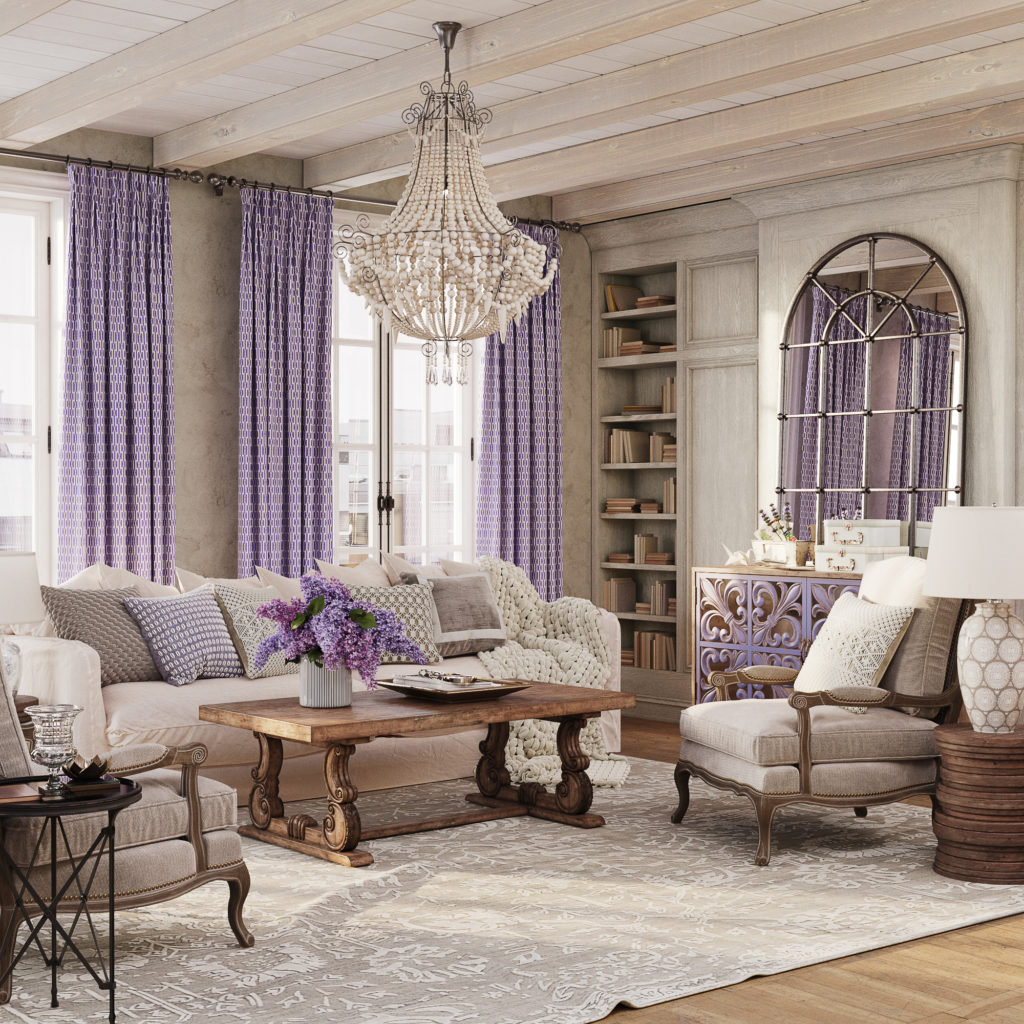
3 – Periwinkle on White
In a Scandinavian style home or another type of minimalism like modern design, Very Peri will look great as an accent colour. Against a crisp, white surface, periwinkle will boldly stand out, without being overbearing. You could even accent over some shades of off-white, but cream or ivory may be too much.
Design Ideas Using Very Peri
4 – Fresh Coat of Paint
If you are ready for a bold 2022, why not start with some bold home design? Very Peri and periwinkle make an excellent accent wall in larger rooms if it does not disrupt your existing colour palette. And for smaller rooms that are typically plain, like a bathroom or walk-in closet, you can reinvigorate the space with a full remodel. A fresh coat of Very Peri paint and some new decor will add a bit of powerful moodiness to your home for the new year.
5 – Take It Outside
A new colour does not necessarily need to go indoors in order to add energy to your life. Very Peri works well alongside tan, brown, and some shades of natural green – making it a great choice for the exterior of your home or condominium. Instead of staining a wooden deck or stairway in the spring, paint the banisters or steps the deep, inviting colour of Very Peri. Or, repainting your front door in a periwinkle tone could signal to all visitors that you welcome change and creativity.
6 – Moody Bedding
Not quite ready to break out the paint cans and brushes just yet? Well, deep, cool colours like Very Peri add a sense of relaxation to textiles and bedroom linens. The violet-red undertone in Very Peri injects a hint of vitality that offsets the depressive effect of too much dark blue. Replace your sheets or other bedding with a fresh set of periwinkle-coloured ones, and you will wake up to an exciting new style each morning in 2022.
7 – Delicate Flowers
Periwinkle is also a type of flower – a petit-petaled, natural beauty. You can either use living periwinkle flowers to add a fresh, temporary bit of Very Peri to your home. Or, combine a lighter shade of purple or periwinkle-coloured flowers with your Very Peri accents to liven up your condominium or house.
8 – An Inventive Home Office
The energy, ambition, and inner peace promoted by the colours in Very Peri make it a wise addition to a home office. Many people are still adjusting to working from home, or their workspace needs an upgrade. You could repaint your home office walls or simply add lots of periwinkle stationery and accessories, to spark more creativity or motivation this year.
Get Creative!
The whole idea behind Very Peri is to encourage personal creativity and inventiveness. Do not let anyone else tell you exactly how to use this rich new colour – if you have an idea, make it a reality! The designers at Design Qandy can help you create your ideas for this new colour, so send us a message today.

